Hennessy's Hair & Beauty have been in business for over 35 years in Cork, providing hair and beauty products for customers, students and businesses alike. During a Design Usability module in college, I was tasked with reviewing the functionality and effectiveness of their existing website and coming up with a new proposed design based on research, feedback and shortcomings of previous design.
The following designs below are the existing designs (on the left) and my proposed designs (on the right).
The Logo
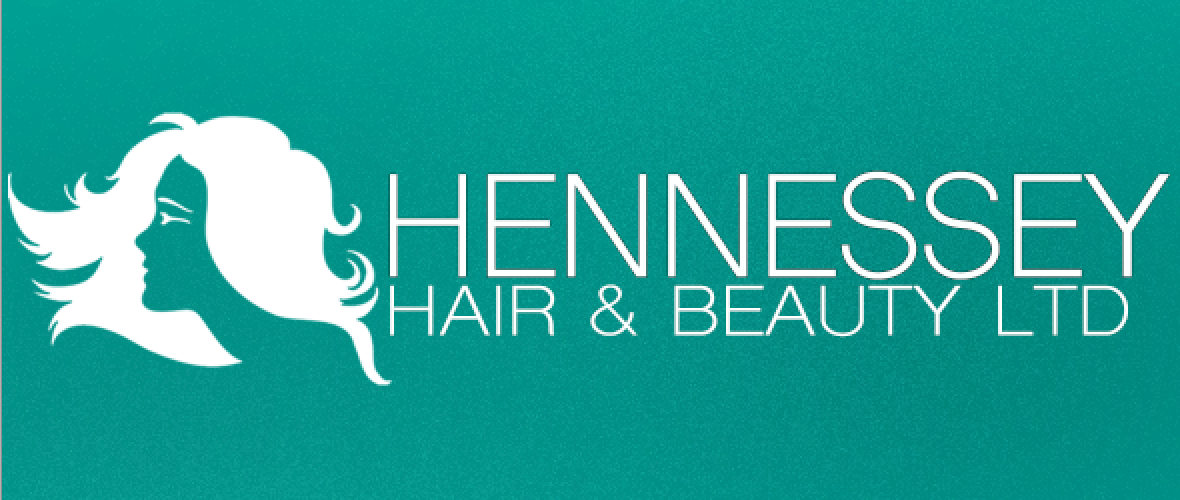
One of the first things we had to do was come up with a new proposed design for a logo. For mine I decided to use a more unisex colour palette and chose a slender light-weighted-sans-serif font to look a little more modern while maintaining a feminine look. Lastly I decided to use a silhouette of a woman with flowing hair to simulate the same flowing lines that appeared in the existing logo.


The design received positive results after being showed to a focus group, come of the key points that subjects liked about the design were the teal colour, the light font and the more rectangular composition of the logo as opposed to the current square one.
The website design
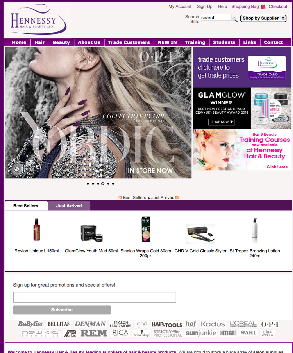
The new proposed site design is a result of a number of elements such as system usability scale results, user feedback and comments from a focus group. Aside from the site looking quite out of date, probably the biggest shortcoming that the Hennessy site suffered was that the website suffered an information overload on a number of pages. So my job was to come up with a more user-friendly design while remaining adequately functional for educational and professional customers alike.


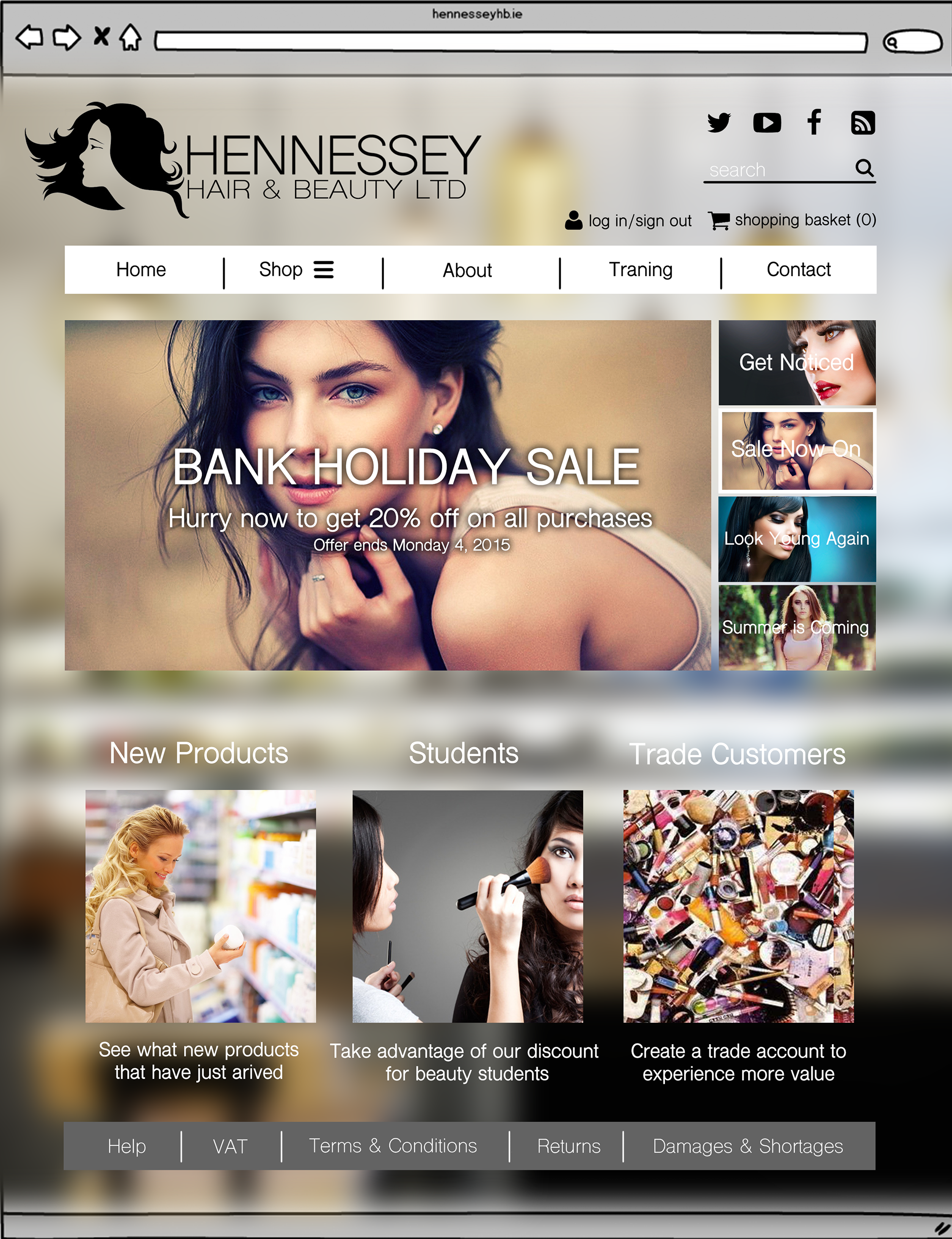
As seen above, I have heavily simplified the layout of the website in my revised design. To summarise I got rid of the best seller section and decreased the number of links in the header. I simplified this by moving all shopping related linked into a Shop button and moved the Training and Student linked to the lower half of the design. I also maintained some of the main functionality by creating cleaner versions or the top-right corner and a nicer looking image carousel in the centre of the screen.
While creating this new design, I found that the teal colour palette I used in the design was not working out too well. So instead i decided to turn my revised Hennessy's logo to back and used a blurred out stock image of a cosmetics shops to maintain a feminine look while remaining neutrally coloured.
I was really satisfied with the final design outcome, the final design is a modern improvement of the existing design which maintains the same level of functionality while looking much more elegant and relatively easy to code by a web designer. I would love to see Hennessey's adopt some of these design elements in the future years to come.
