Legit Fit are an Irish SaaS (Software as a Service) company based in Cork with the goal of bringing the health and fitness world closer together.
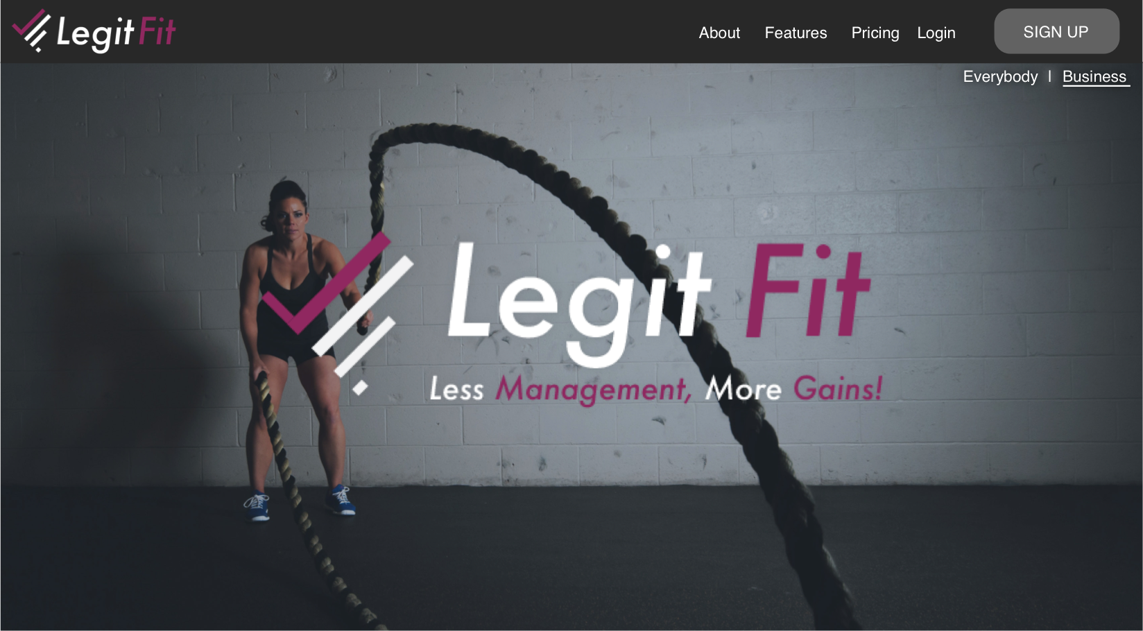
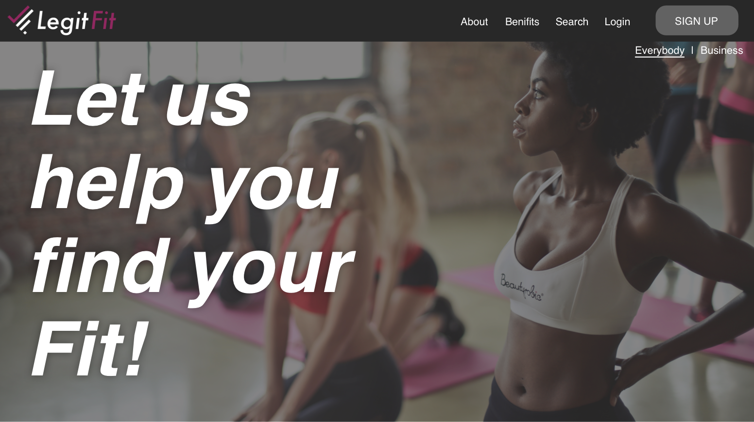
Their new web application will allow the general public to find and connect with Health/Fitness professionals in their area while allowing the professionals to manage their clients and overall business more efficiently.
Since November 2017, I've been working with the company, initially re-vitalising the design of their logo and more-recently, I worked the designing a new website as they approach their product launch later this year.
Project 1 - Logo Design
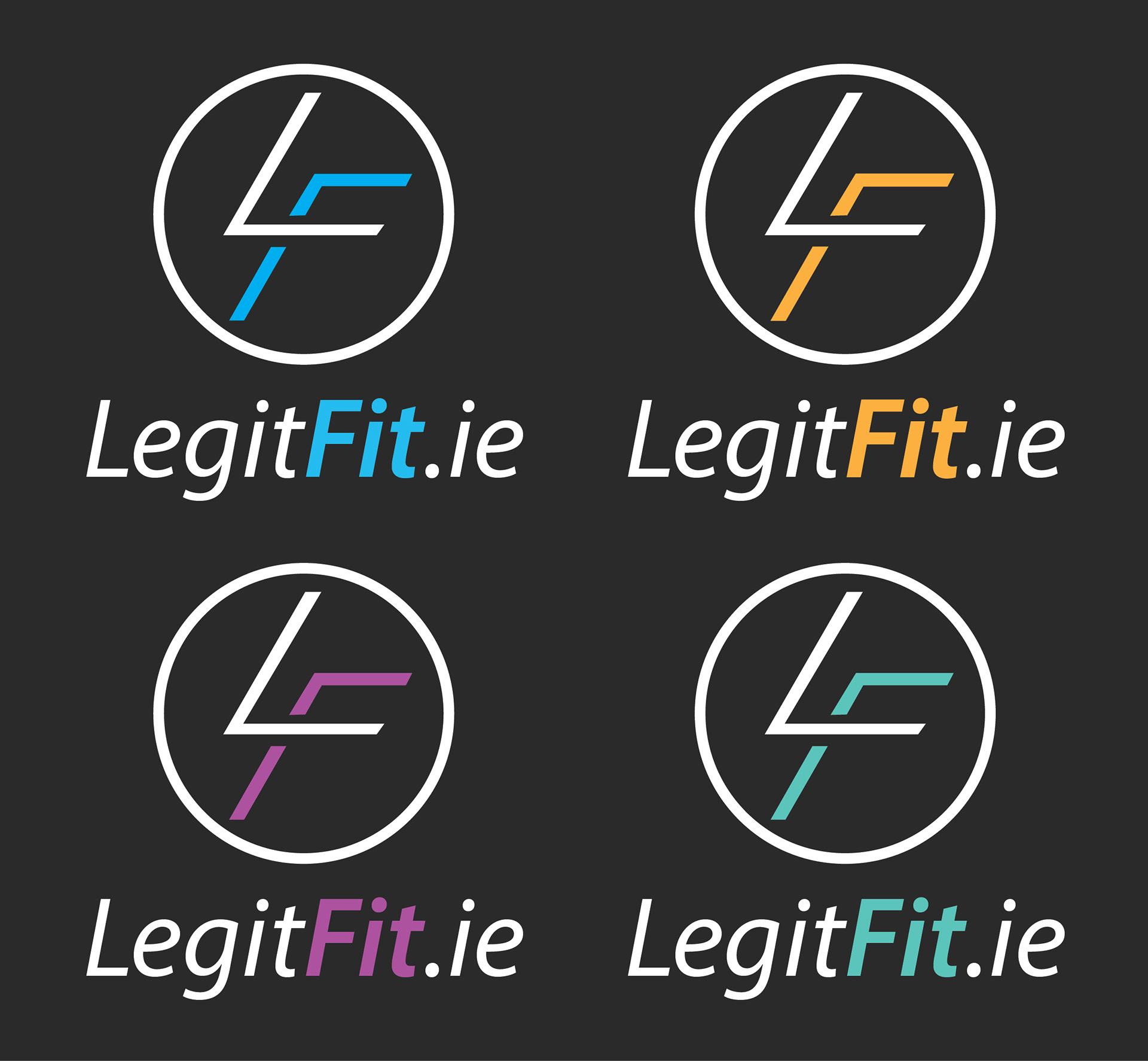
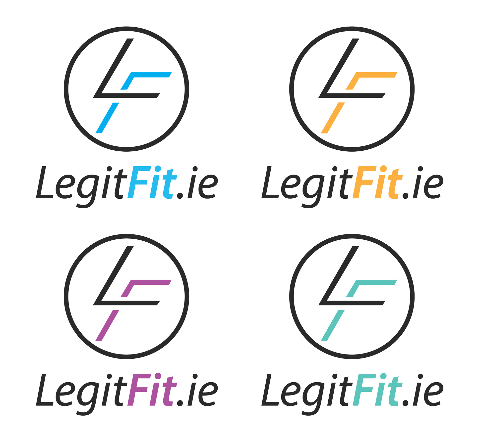
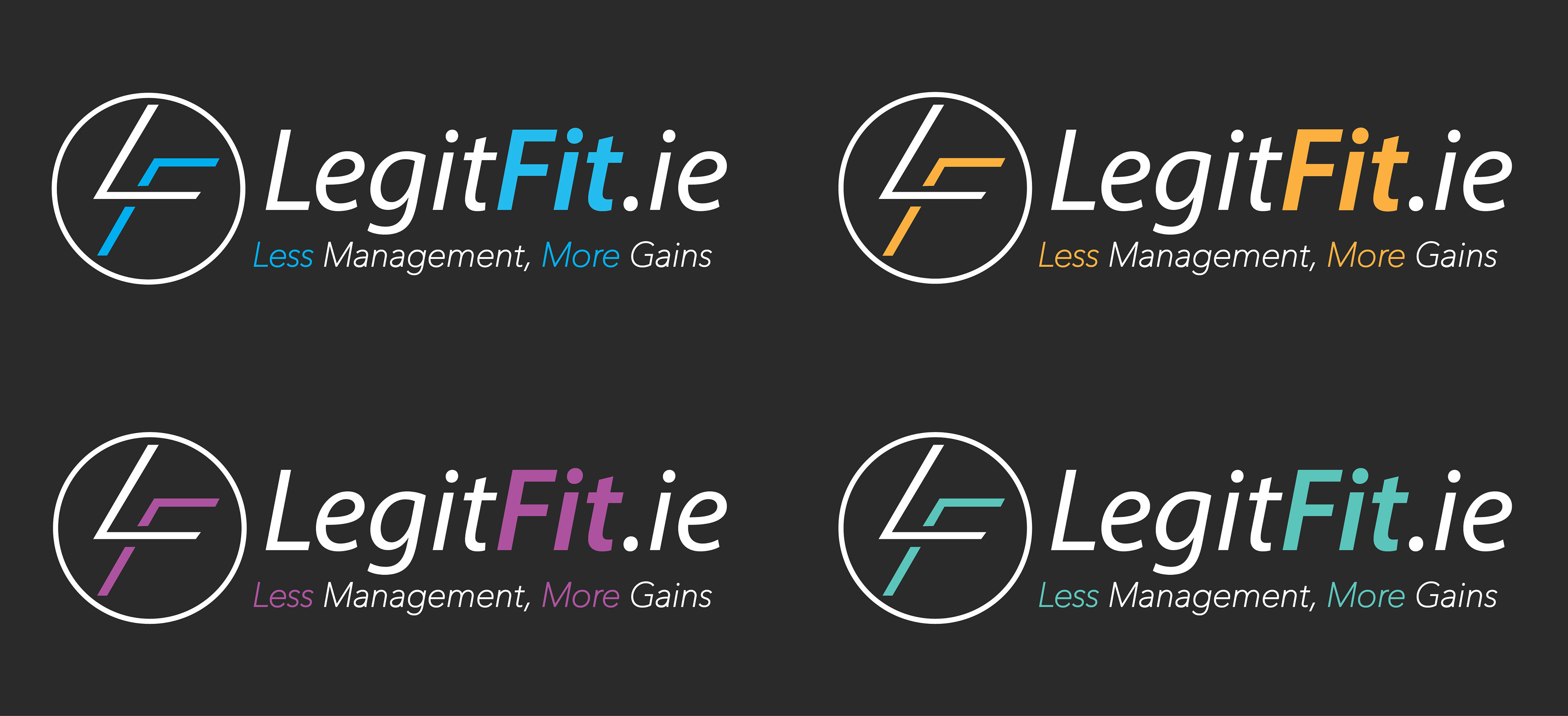
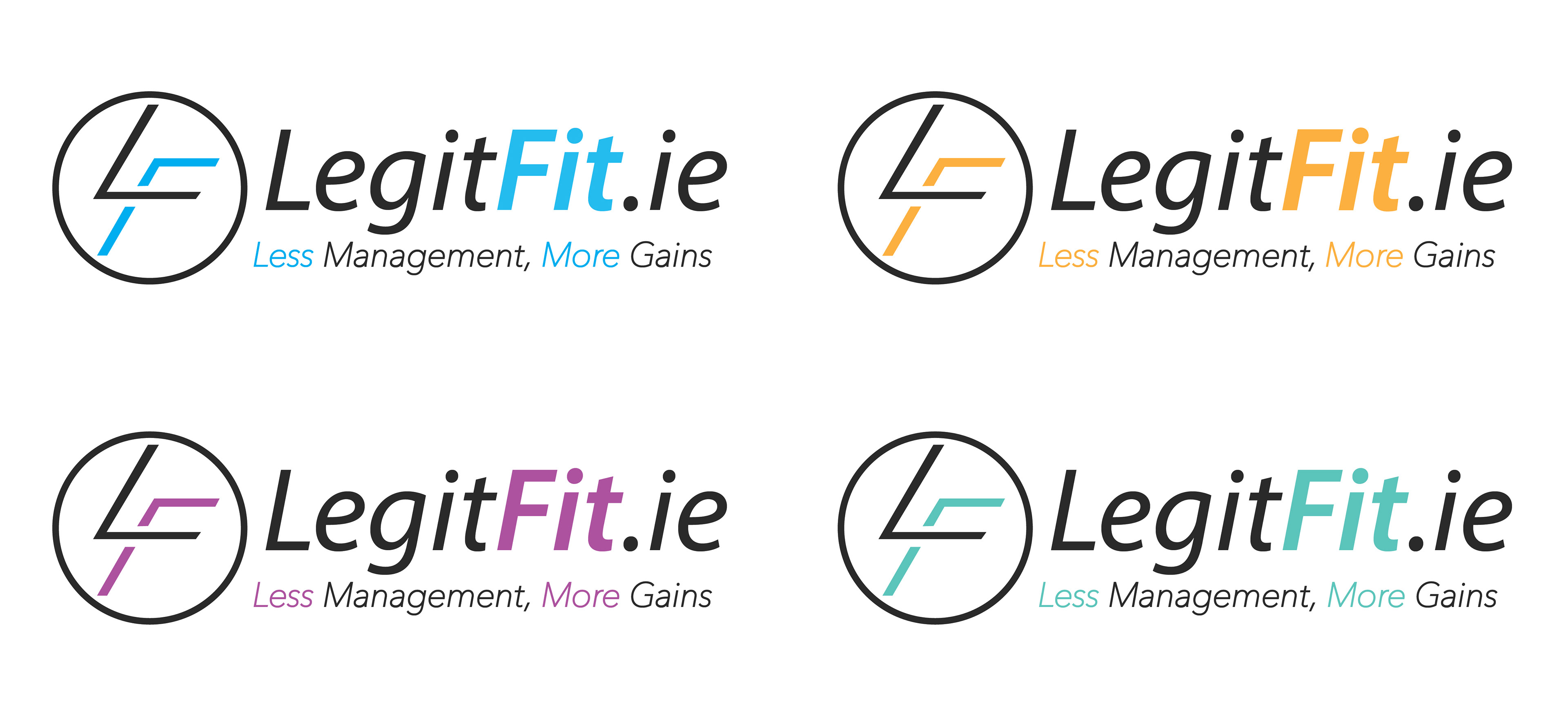
The first project with Legit Fit involved coming up with a revised design for their logo. The logo was close to complete and only required some subtle changes and refinements. Some of these main changes included:
1 - A re-design of the L - F symbol
2 - Adjustments to the kerning & changing LegitFits.ie's font to italic,
3 - Using a tagline/slogan,
4 - Introducing a secondary colour.
A multitude of logos were designed using different colours, styles and orientations. After some review, Ryan the co-founder of Legit Fit chose to go with the purple version of the logo (pictured in the top-left corner). This design would then continue to be used in documents and for promotional purposes until May of 2018.
Project 2 - Legit Fit Hack-a-thon

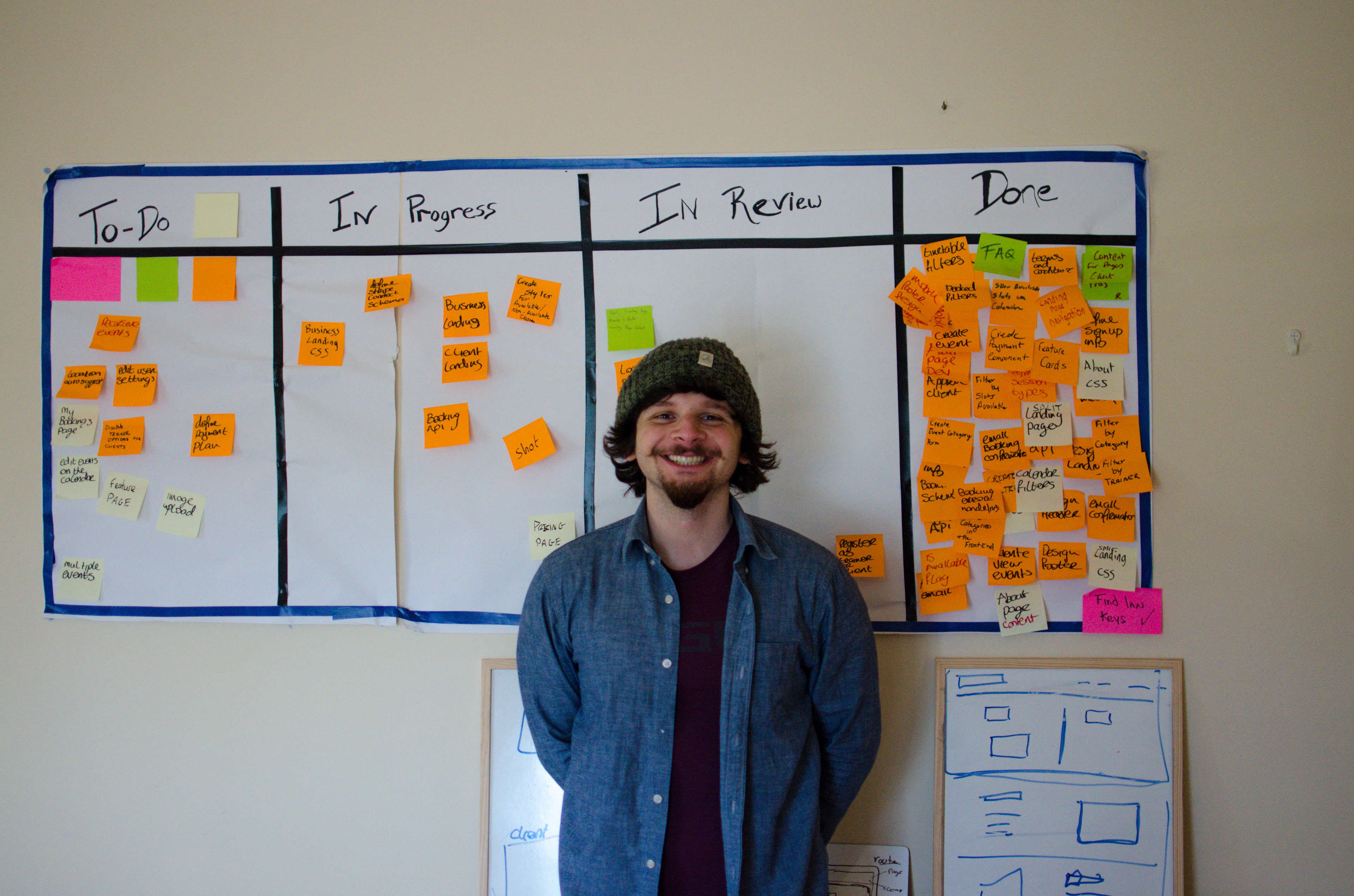
In mid-May I joined the Legit Fit team once again to take part in their first ever Hack-a-thon, which involved participating in a weekend long event with a development team to help produce Legit Fit's website and online app.
The Hack-a-thon took place over 3 days and the team consisted of 6 people and each person had a different role. It included:
Paul (me) - graphic & ui/ux design of the website
Thomas - html & css for the website
Ryan - writing website content
Lucas - app design & functionality
Gearóid - app design, payments & security
Ian - Team Leader/Project Manager
My main roles consisted of creating rapid prototyping the website as well as creating or sourcing all of its graphical content. Stock images were sourced on royalty-free websites and graphical assets were created/edited using Adobe Photoshop & Illustrator. With the addition of Ryan's information content. The website was then laid out and designed using Sketch App, a Ui/Ux design program.
Sketch was Legit Fit's chosen app for the Ui/Ux design and it was my first time using the program. It has similar functions to Photoshop, Illustrator and InDesign so learning to use it took only a few hours.
Although I was not writing any html, css or javascript on this project, my knowledge of these skills allowed the team to collaborate effectively on all subjects like the design, functionality and troubleshooting while building the site.
Website Summary
Legit Fit's website serves as an informative gateway for their on-site web application and services. It's goal is to provide potential users with all the information neccessary to help them make an informed decision to sign up.
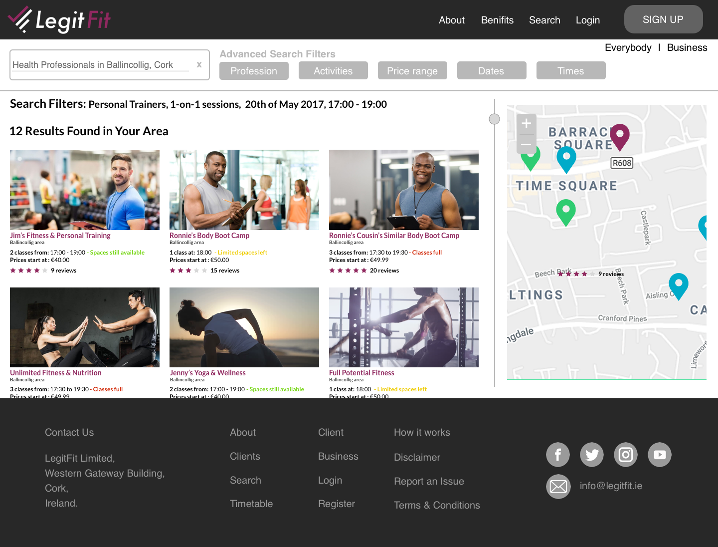
The type of online service depends on whether you're a health/fitness professional or a member of the general public. So to avoid confusion, the site was split into a Business Side for professionals and a Client Side for the general public.
Headers, Footers & User Menu's
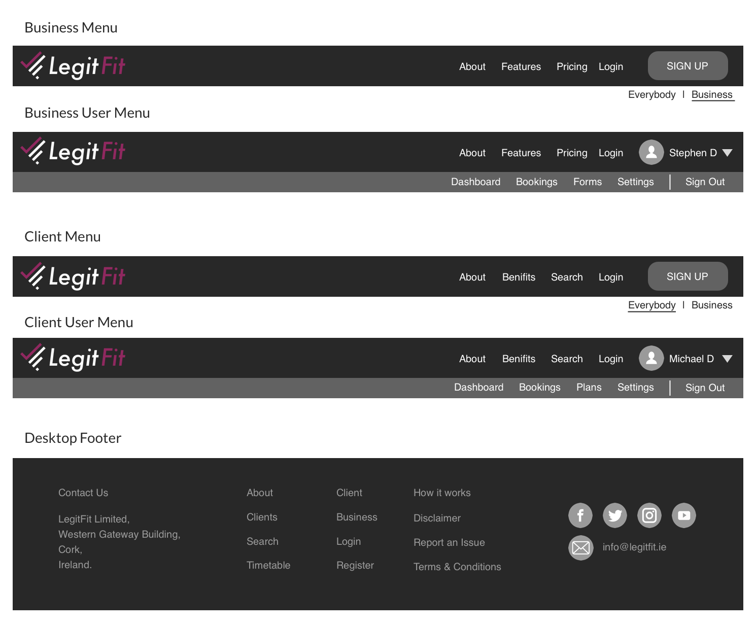
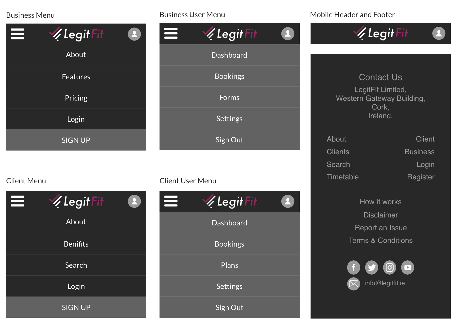
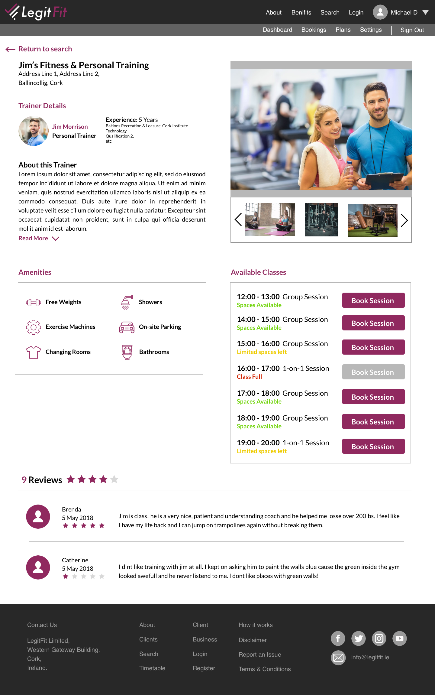
The header and footers are similar in style but the menus are unique to each side of the website. When signed in the user name will appear with a profile picture/icon and when clicked a user menu will drop down. Again the options in the user menu will be unique to the type of user that is using Legit Fit.
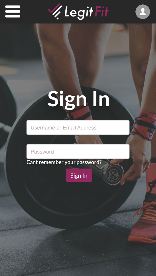
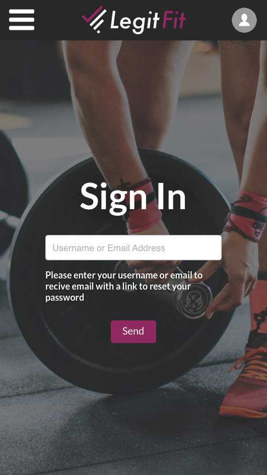
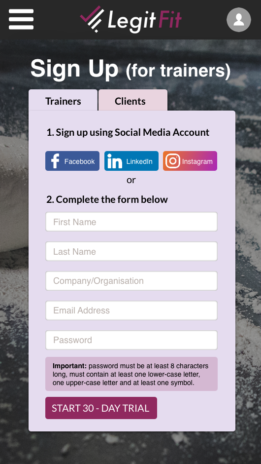
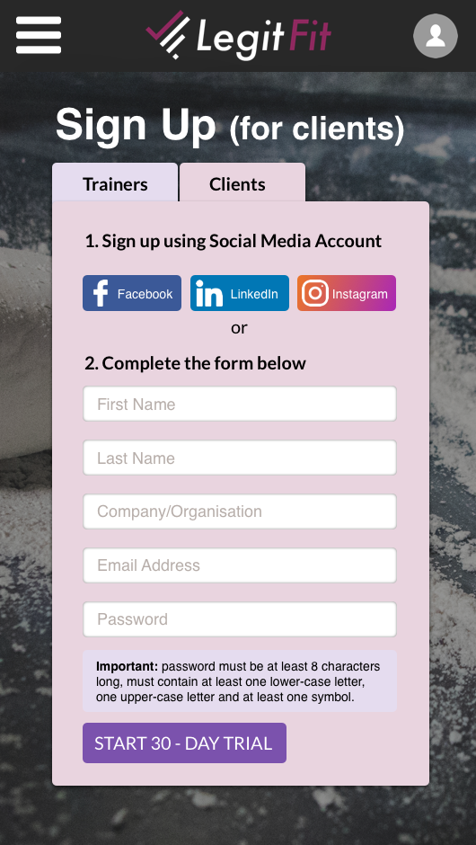
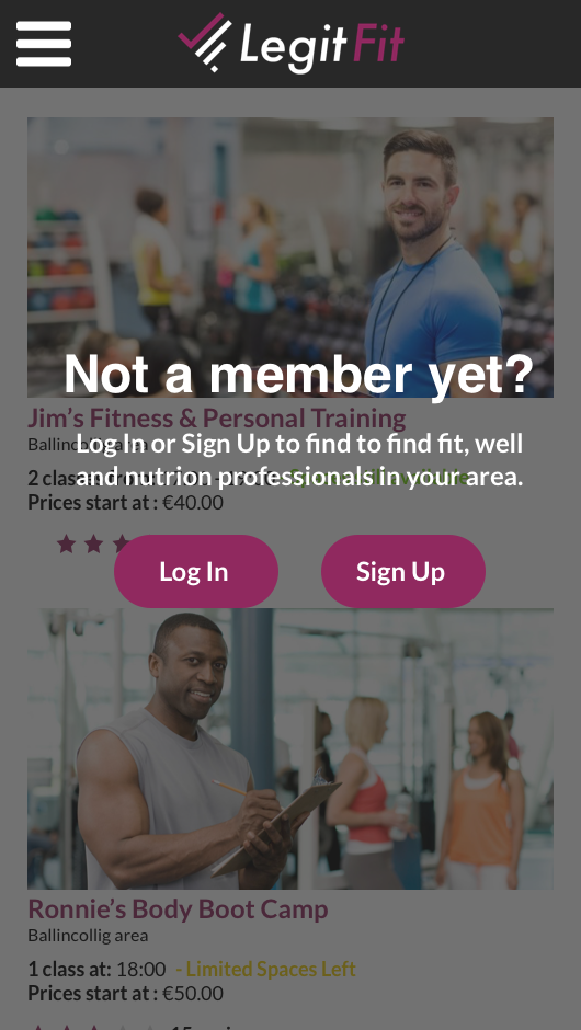
As the website was being designed, a mobile version was also being designed and created at the same time. Because of the smaller work/viewing space space, drop down menu's were used and the text in the headers and footers were increased to prevent incorrect menu selecting.
Shared Pages
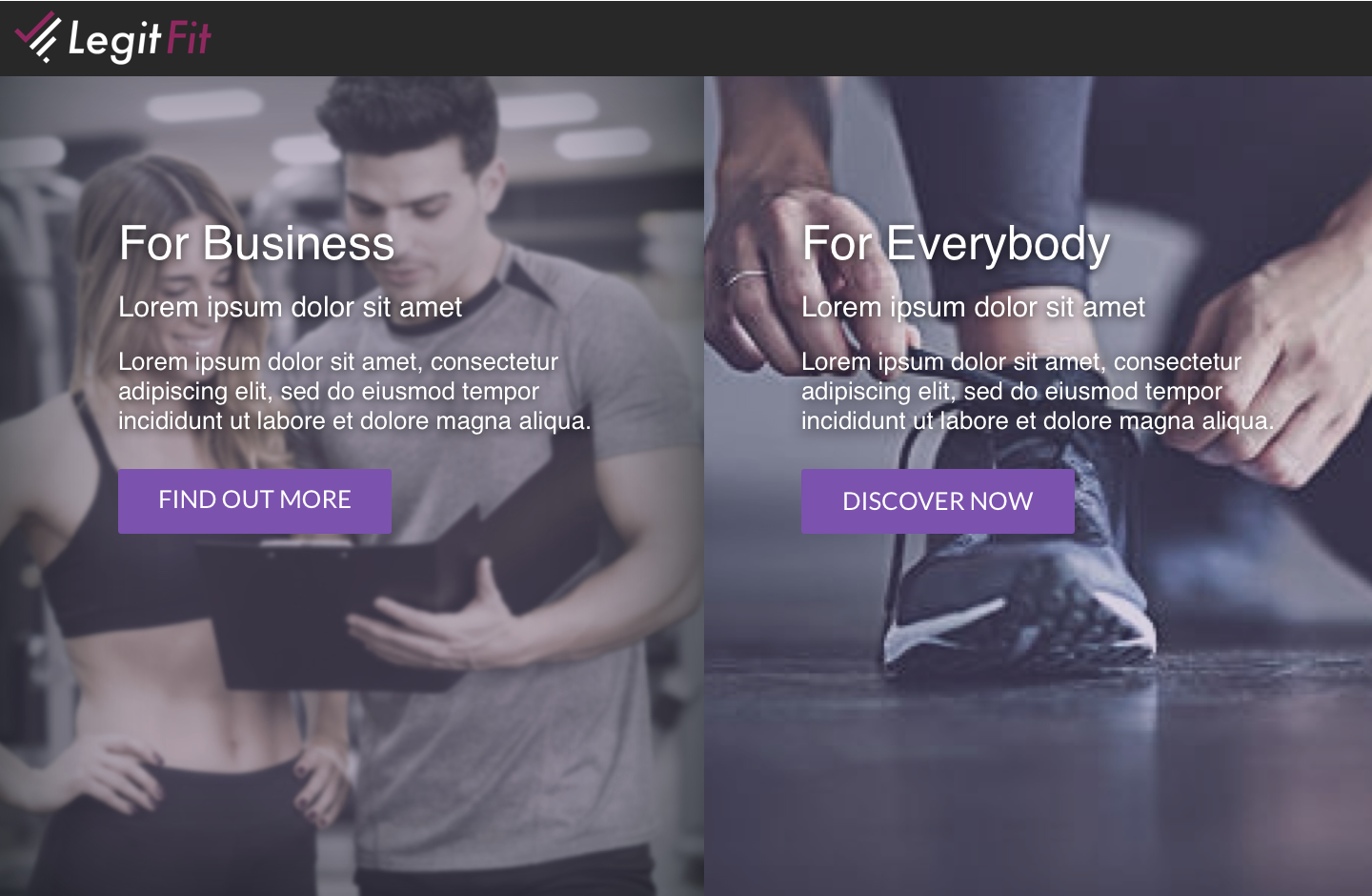
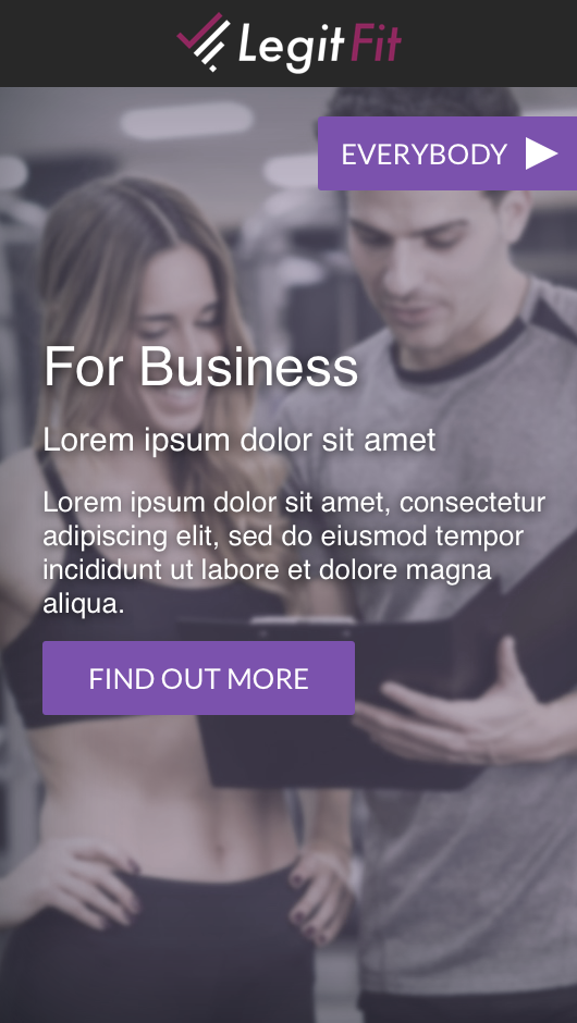
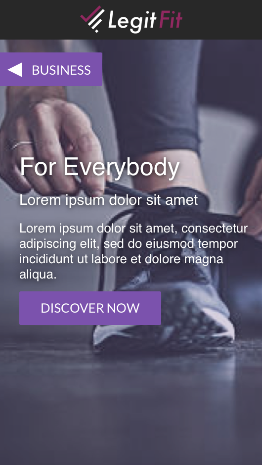
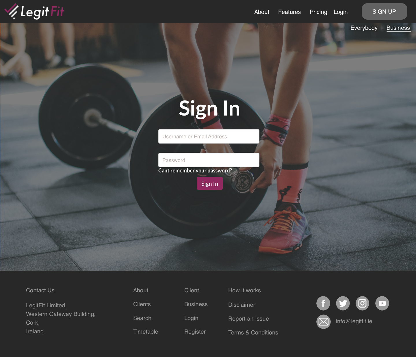
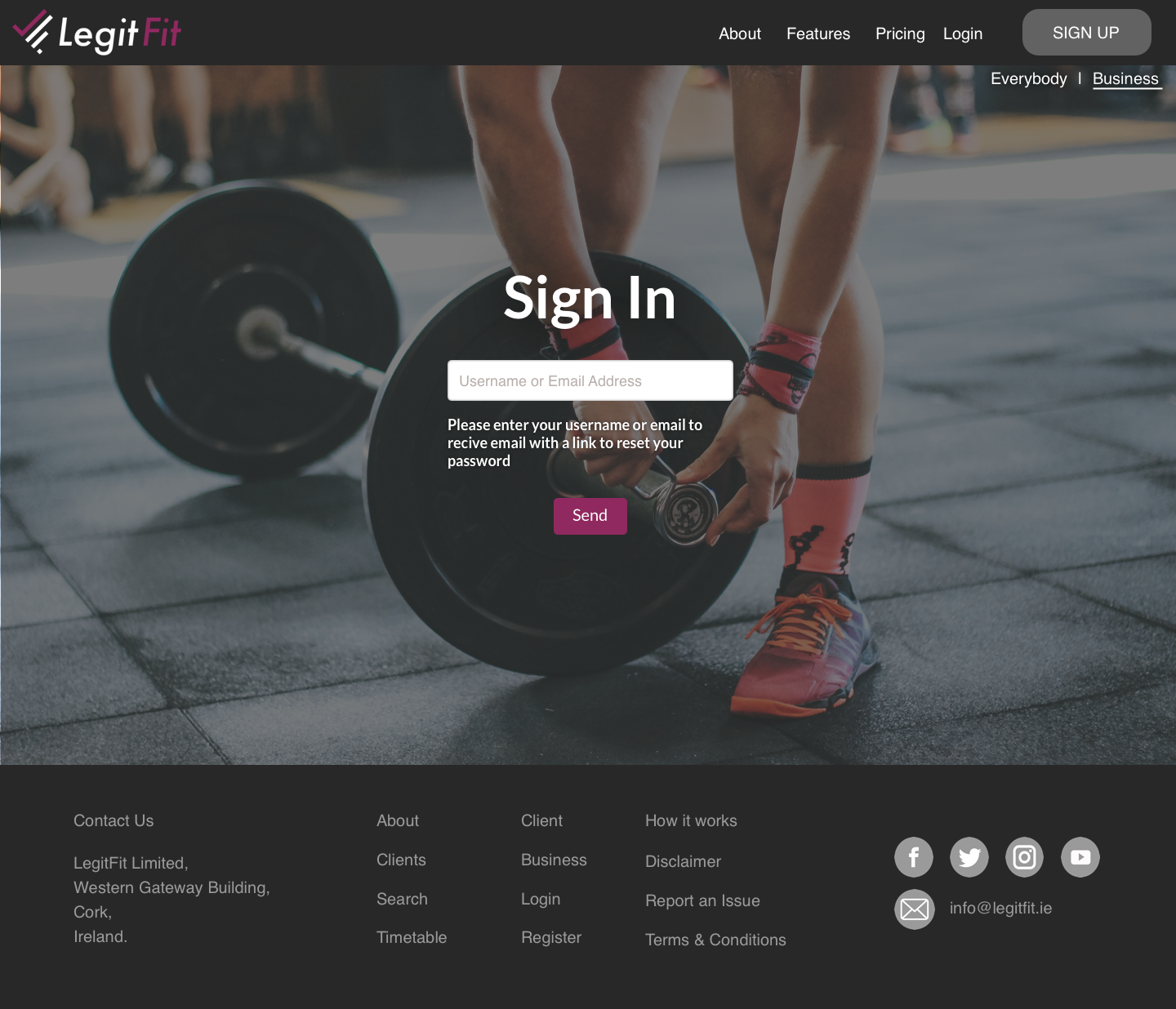
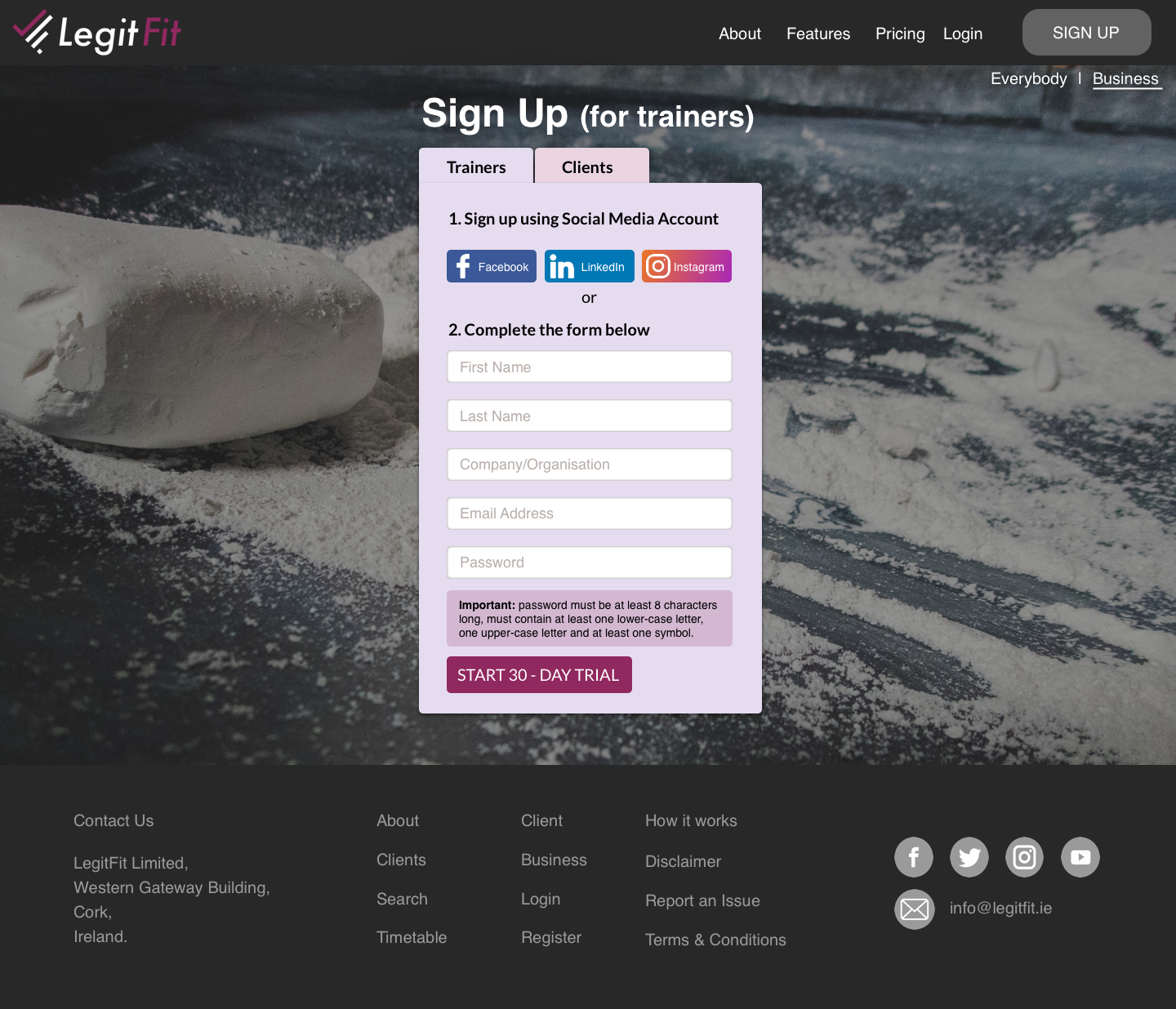
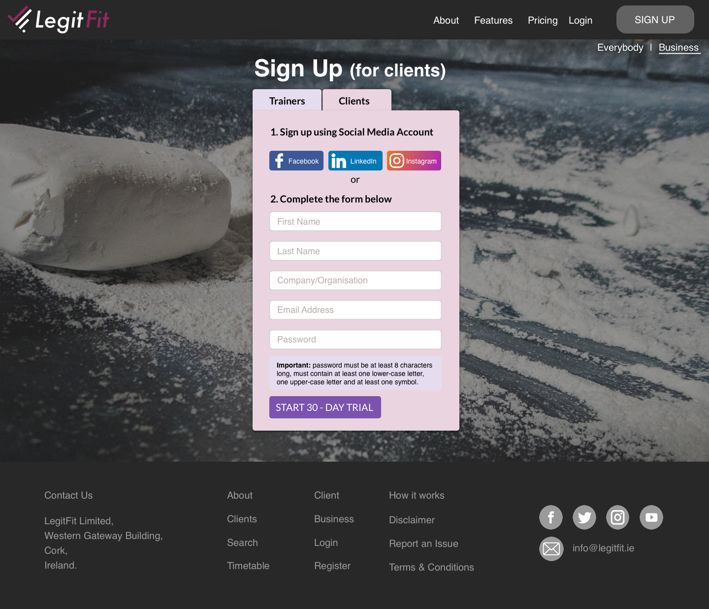
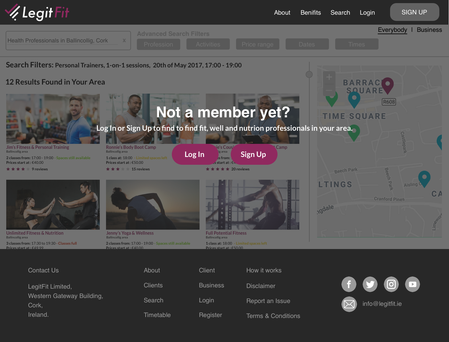
The only common pages on both sides of the website are the general landing page when you first access the site, the sign up page, the sign in page and the re-send/change password page.
Business Pages
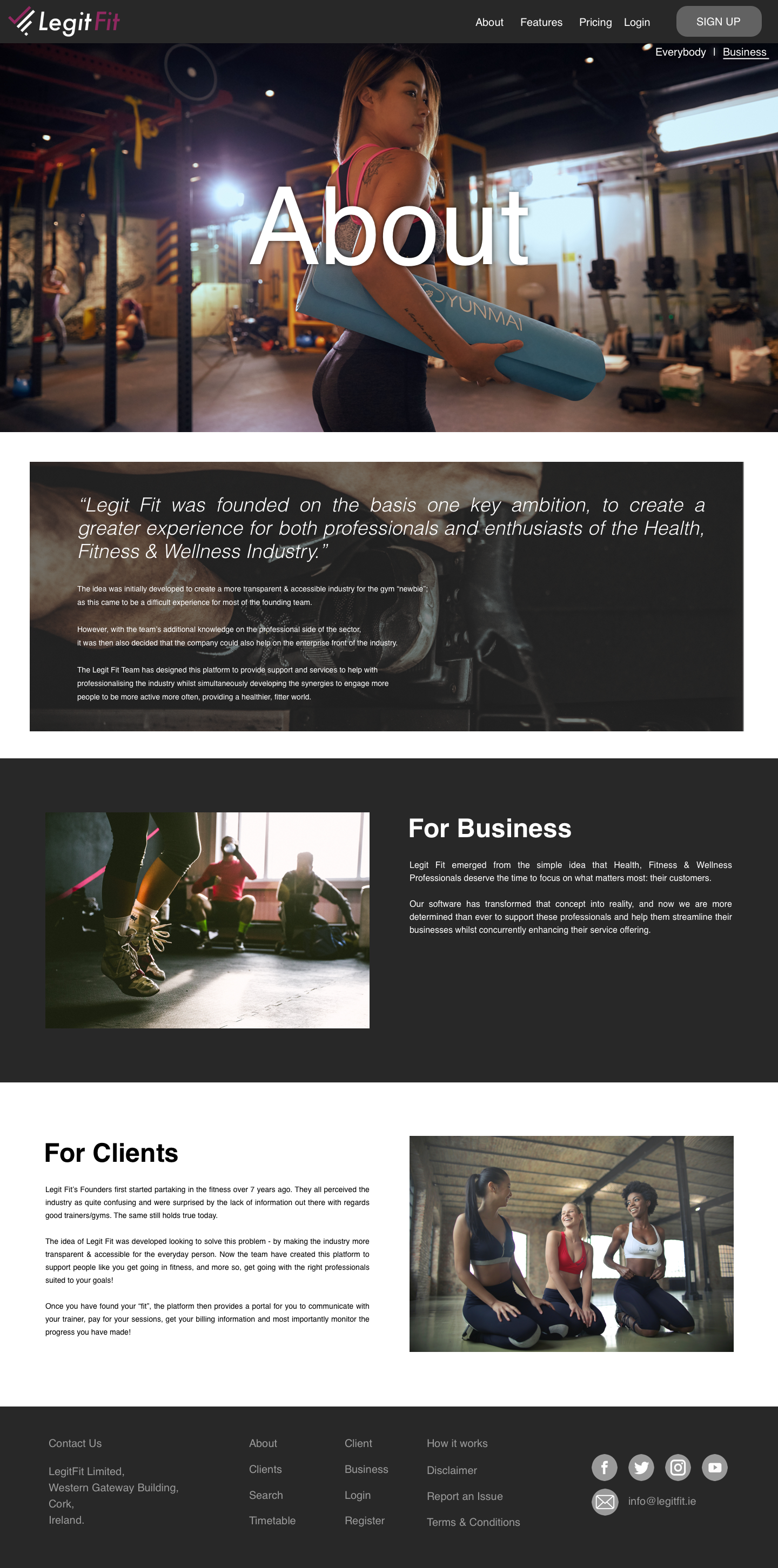
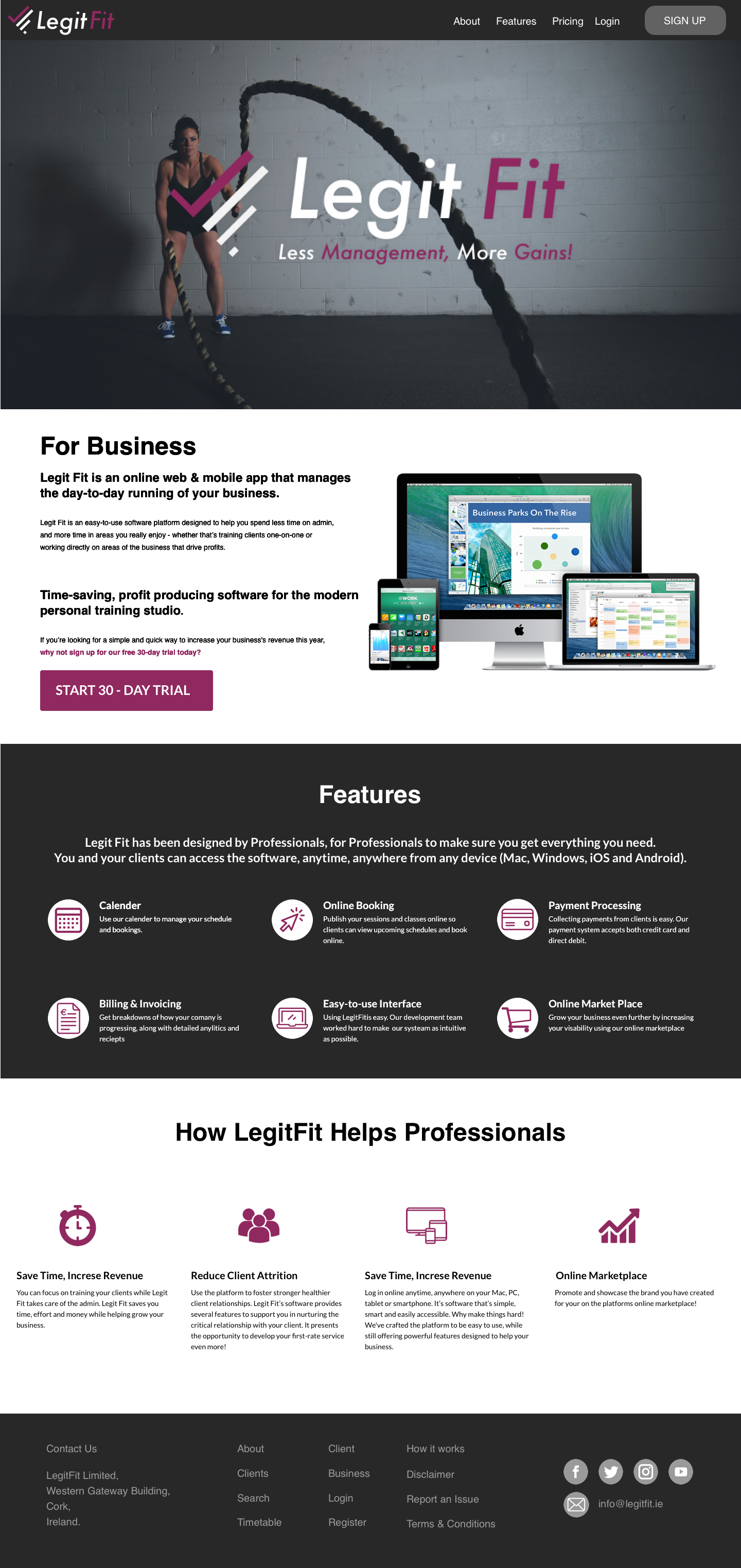
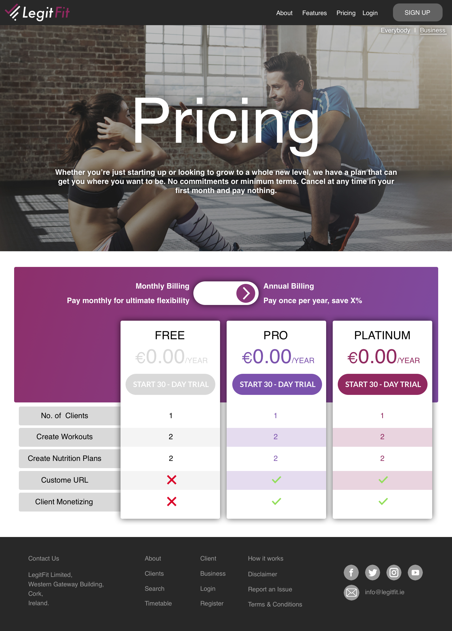
The pages unique to the business side of the website include an About, Features and Pricing Page. The respectful pages provides the user with the insight behind Legit Fit's development, the features & benefits they offer and the type of price plans a customer can avail from.



Client Pages
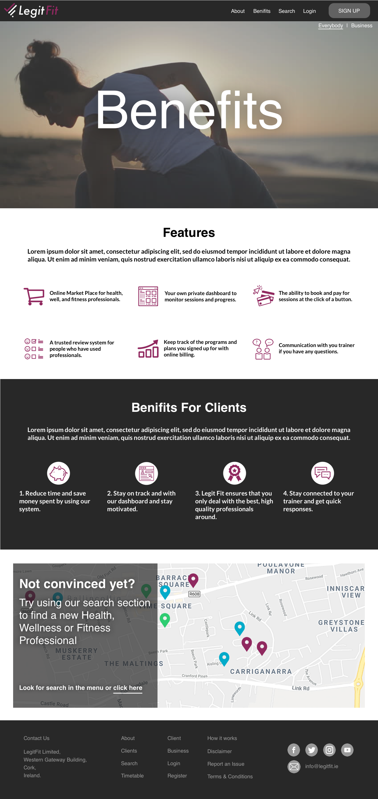
The client pages consist of their own About Page, a Benefits page and a Search page. Non-professional users will be able to use Legit Fit to find health/fitness professional, book and pay for appointments and contact their trainer all on the one system. So before they can start searching, Users will have to sign up first.





New logo
Over a few beers the team discussed the design for a new logo. The team voted on a their favourite sketches and a variation of the new symbol pictured below was selected. Originally the design was a tick and a graph to symbolise the tracking of performance. But after some slight adjustments the team realised that the logo could also resemble an L and an F if spaced out correctly and turned on a 45-degree angle. A slight font and secondary colour change later and we had the design for the new logo.
Project 3 - New Business Cards
Ryan recently contacted me once again in June look to have new business cards designed for him and other co-founder, Ian. Almost two dozen designs were created consisting of different designs, colours, patterns and corporate messages. This gave both co-founders to be unique with their own design or resolute if they wished.
After some review both co-founders decided to go for the same style card, front and back. The back of the card includes their name, contact details and the new L-F logo slightly faded and the front contains the logo, the "less management, more gains" slogan and a pattern created from the L-F logo turned upside-down and repeated.
Working with Ryan and Legit Fit has always been a very enjoyable experience and I look extremely forward to working with them in the future. Keep an I our for the website and online app when it launches later this year.
